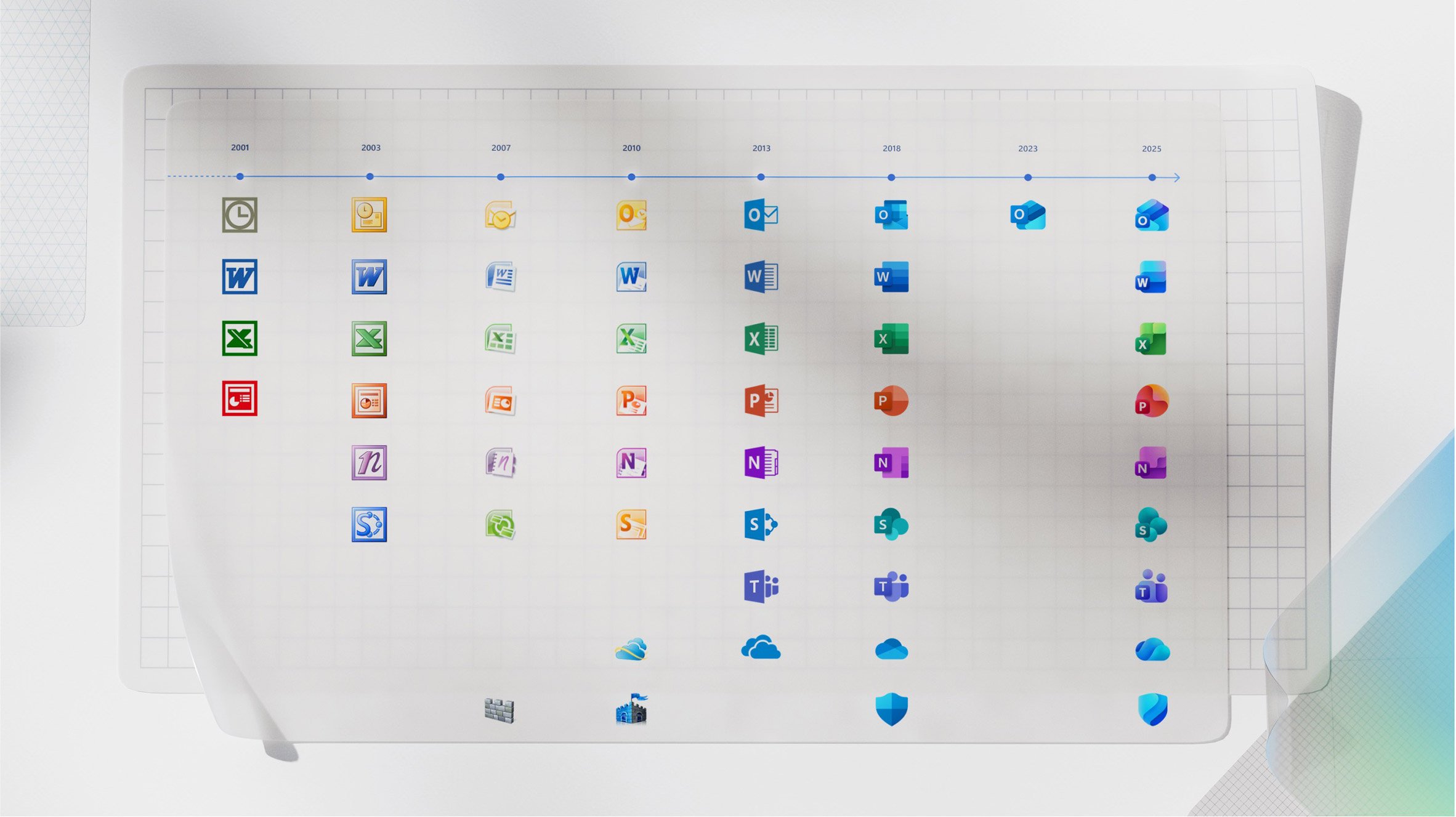
Fluid curves and zingy gradients characterise the updated logos for Microsoft‘s Office applications, which have been redesigned for the first time since 2018.
The project involved “a subtle refresh” of Microsoft’s 10 core Office icons for everyday applications ranging from email to Word and PowerPoint.

Each icon is similar to its predecessor, but updated with curvier shapes that wrap around each other and more vivid colours presented in gradients on each graphic.
The Word icon, for example, is now composed of three stacked rectangles rather than four, simplified to improve legibility and reduce “visual noise”. Other icons feature subtle rearrangements of their softened shapes.

Microsoft also decided to maintain the icons’ letter plates to make the graphics “instantly recognisable”.
Jon Friedman, corporate vice president of design and research for Microsoft 365, said that the “small but significant” rebrand shows “how AI is shifting the discipline of design and the nature of product development”.
Friedman explained that the goal was to swap sharper edges and lines for smoother folds and curves to give the icons a sense of playfulness and approachability. The project is the first rebrand of the icons since 2018.
The updated icons are expected to be rolled out within the coming weeks for web, desktop and mobile users.
In other Microsoft news, the software giant commissioned architecture studio Gensler to design a pair of data centres with a hybrid CLT structure in northern Virgina, USA, at the start of the year.

Brands around the world are constantly tweaking their visual identities, much to the delight or dismay of their customers.
Recent subtle rebrands featured on Dezeen have ranged from an update to Google’s world-famous G icon to a refreshed brand identity for American retailer Walmart that was designed to be bolder and brighter than its former 2008 iteration while remaining largely similar.
The images are courtesy of Microsoft.
The post Microsoft Office rebrand demonstrates "how AI is shifting the discipline of design" appeared first on Dezeen.


